Mobile Design
In 5 Patterns in Design and Methods of Design, we took a look at some lessons on how to approach engage in design, particularly interaction design.
When we speak about interaction design, we are speaking of a more subjective field of design involved with digital materials and human users. Bill Moggridge provides a useful graphic (reproduced below), situating interaction design along the axes of Subjective ←→ Objective, and Physical ←→ Digital.
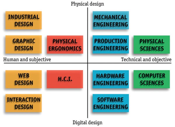
This positioning inside the wider design and engineering space gives context to the closeness of relationship between fields. We can see that it shares the same column as industrial, web and graphic design. We can draw design insights most strongly from these fields, noting that the major differential is that we are using digital, rather than physical materials.
We also see that interaction design shares the same row as software engineering—a field involved with making the computer do things. Interaction design is concerned with people making the computer do things, so while we can draw most of our technical insights and engineering methodologies from software engineering disciplines, we’ll also need to integrate insights from more human-focused fields like Human-Computer Interaction (HCI), Ergonomics and Psychology.
Mobile Constraints
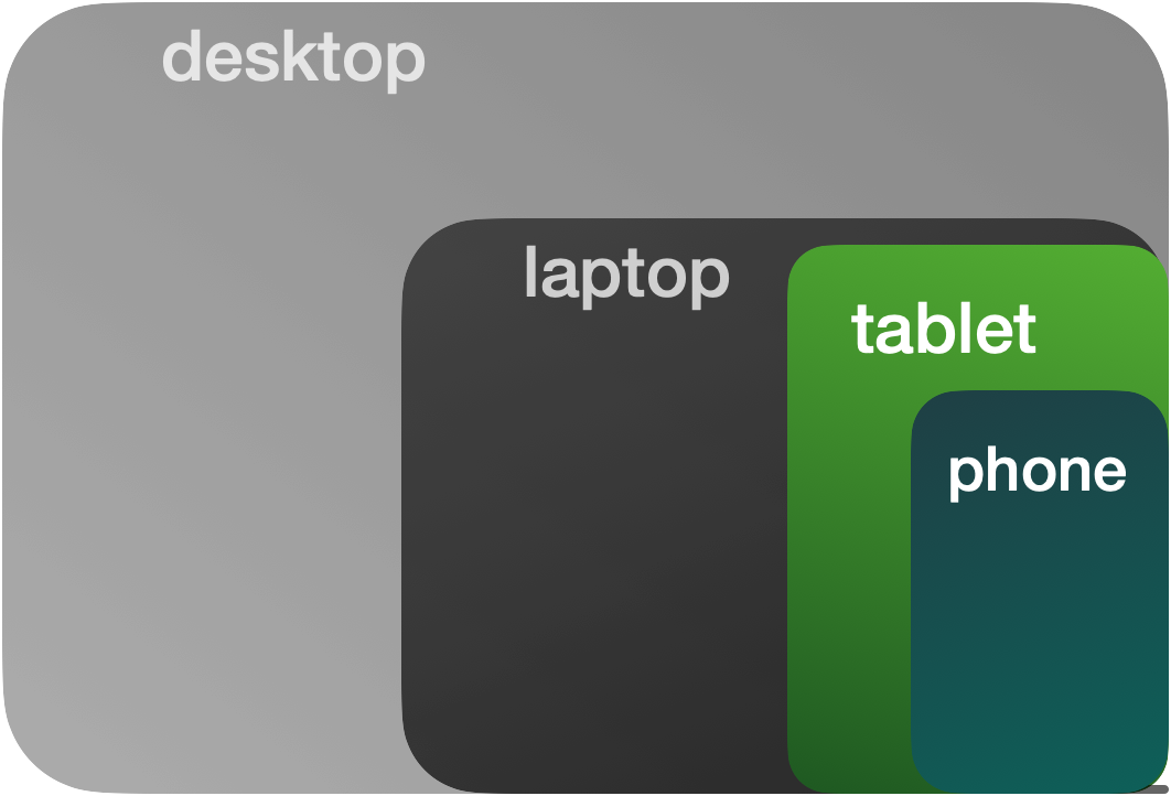
When we design applications, we may do so for a specific device or for a range of devices (cross-platform). In this, each platform imposes its own set of constraints, based on the size, weight, and usage patterns of the device. Here, we will explore the constraints in mobile design, drawing most strongly from Luke Wroblewski’s thoughts in Mobile First.
Screen Size
No surprise here: mobile screens are smaller than computers, often around 6 inches tall and 5 inches wide. This presents an upper bound on what can be laid out, the readability of text and icons offers a lower bound to the size we can make our content. With less room to put things, we make large use of push-pop navigation, popover sheets and dialogs and scrolling screens so we can create more space the user can move to.
Responsive Layout
Unlike on desktops, where we can adjust window size and position, we are forced to respond to whatever size the screen is on mobile devices. Mobile “windows” are fixed in size—the frames of our applications will match the screen dimensions. And it will continue to match these dimensions if the device is rotated, responding to the shape of the screen in landscape and portrait orientations.
Portrait Mode
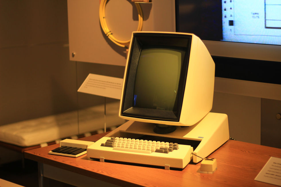
The phone is designed to be used in portrait mode, with the screen running vertically. In most other computing environments, we are used to landscape mode, where the screen is longer than it is tall. This shapes our mobile designs to be narrower or thinner than their desktop counterparts. The Alto, an early personal computer, had a screen designed on the metaphor of paper. In the same way, mobile design often has more vertical space than horizontal, encouraging up-down dominant experiences.
Portable
This is no longer so unique in a world of tablets and laptops, but the size of mobile devices makes them the most portable, meaning they will be used in the most varied settings and be with the user for the most amount of time. Given varied locations of use, design must consider network availability and strategies to mitigate inconsistent connections (caching, local-first). Given the varied uses the mobile device takes on, we also should design to be good citizens, not using more battery or memory than is needed. What’s more, we should be cognizant of the proximity of the phone to the user in stressful or emotionally-intense situation, and take action to ensure our designs are appropriate for these moments.
Gestures
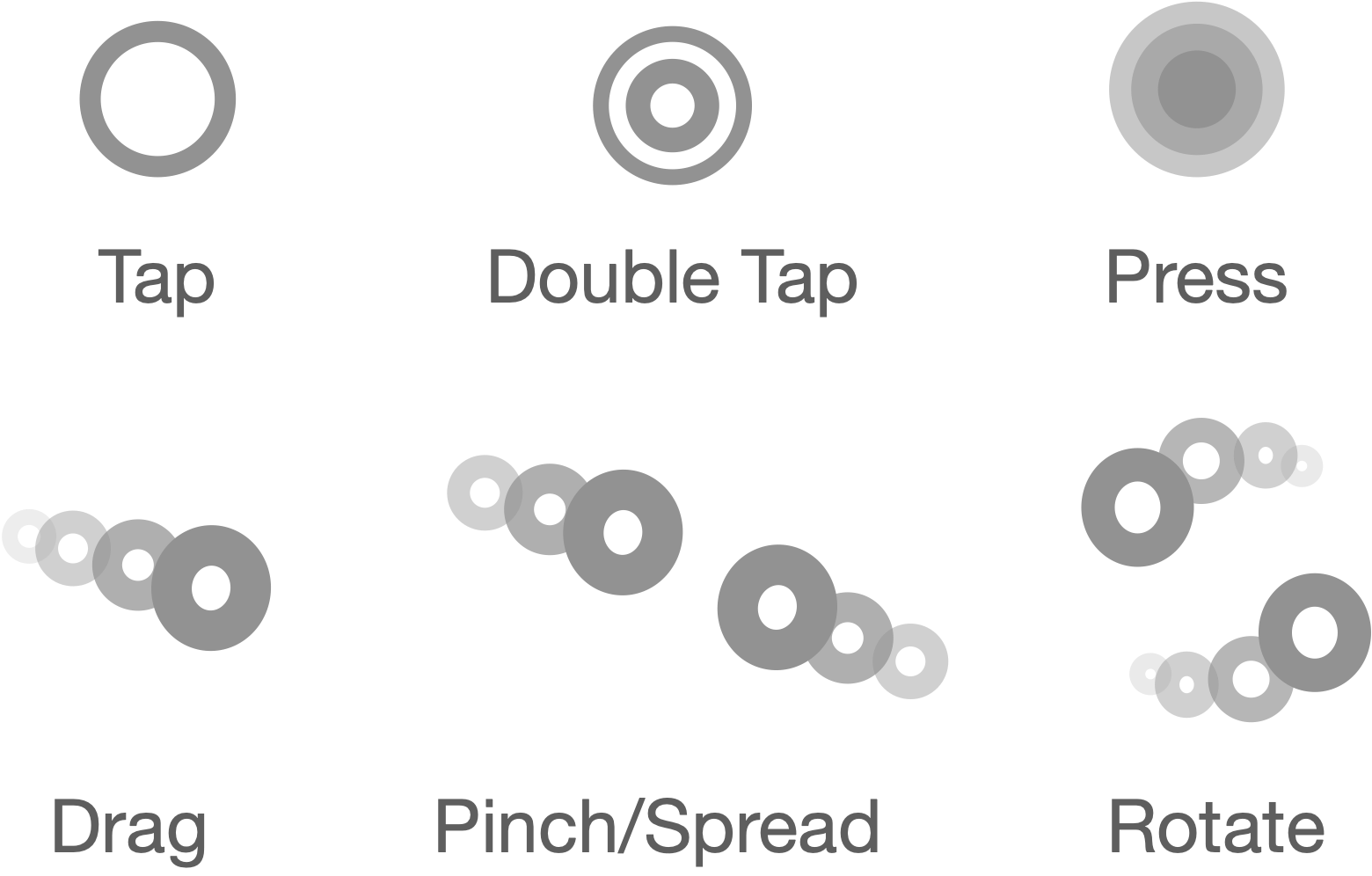
Given the touchscreen natures of phones, each system provides a set of common gestures that will be recognized by the system. These common gestures will be familiar also to the user, being made use of across the device.
Common gestures include tapping, pressing, dragging and pinching. These gestures make up a sort of gestural language, in which certain “phrases” contain meaning to the user. For example, the user expects tapping something to have a different connotation than pinching it.
Touch Size
In order to pass a gesture to a screen object, we must ensure the object is big enough to touch. While the size of the screen and readability of content present an upper and lower bound on presentation, the touch target size enforces a lower bound on interaction. We must make the elements on screen a certain size (often 44 px) so that the touchscreen will register touches on them in consistent ways.
Finger Reach
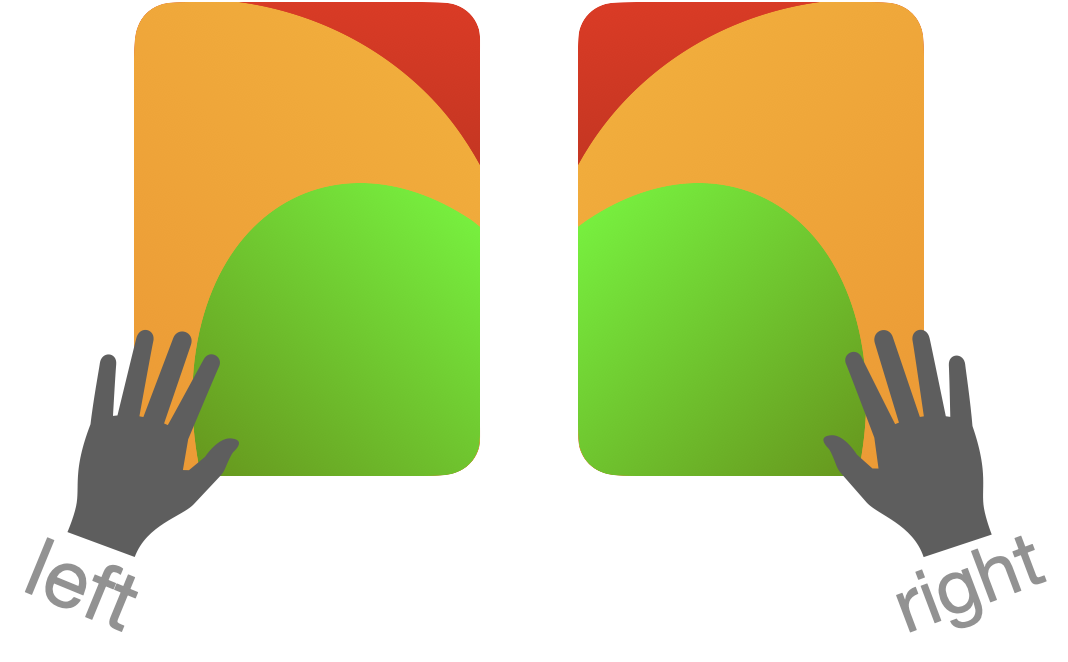
Given that mobile devices are handheld, our hands often adopt a cradling position, making heavy use of thumbs to interact with the screen. In this, the the ability of our fingers to reach different parts of the screen is a spectrum—the bottom of the screen is easier to reach than the top, and the side of the dominant hand is easier to reach than the other.
In general, this shapes the layout towards putting more heavily-used controls lower on the screen and on the opposite side to the cradling hand.
Application Design
When we speak about mobile design, we are speaking about a field of design that is a subfield of interaction design. More specifically, mobile design is a subfield of application design, within the larger field of interaction design—just as automotive design is a subfield of industrial design.
We can break down applications into two layers: the core concepts, and the frameworks used to organize these concepts.
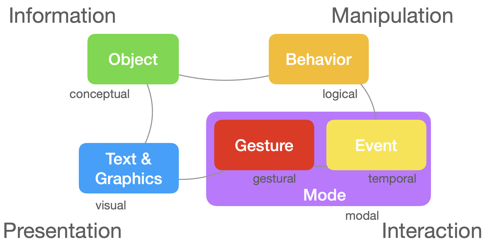
Core Concepts
In order to get a high-level understanding of application design, we can address the abstract concepts involved: Text & Graphics, Objects, Behaviors, Events, Gestures, Modes. These core concepts are not all-encompassing, but define the basic form that applications take, in terms of their information, presentations, interactions and manipulations. We can think of these as we might the amino acids in proteins—their arrangement (in space, chronologies, and hierarchies) defines their structure, and their inter-connections further refine their shape.
Text & Graphics
Fundamentally, applications serve to presentText & Graphics on screen. Together, these define all the visual elements of the application, or the content. Anything shown on screen falls into onto of these two classes.
Objects
We organize these primitives—Text & Graphics into Objects, which aid in storing, presenting, and handling changes to them. Not all objects are persisted in memory long-term. Some objects just live in memory while they are presented on screen. Other objects do live in memory for long spans, and some of these persist after an application is quit, stored in either the file system or a database.
Behaviors
Change occurs in applications through Behaviors or logical processes. Objects adopt these Behaviors which allows for their contained information to be updated. These might things like create/delete, update properties, find (search/sort/filter), edit, navigate and so on.
Events and Gestures
We trigger Behavior by sending Events. These Events are product of Gestures, or the input from the user. When the user interacts with the screen (like when they tap a button), the application recognizes the Gestures (tap) and generates an Event (deleteButtonTapped) that triggers some Behaviors (delete this object).
Modes
The Modes (or Activities) of an application determine when Gestures are made available to the user, and in turn, what Behaviors they can engage in with the application in the given Modes. They serve as the top-level organization for all of the other layers (Gestures, Events, Behaviors, Objects, Text & Graphics).
Frameworks
Surrounding application design, we’ve constructed a number of layers to understand how to go about organizing Modes, Gestures, Events, Behaviors, Objects, Text & Graphics We can think of these as high-level frameworks, like Apple’s Human Interface Guidelines, software frameworks, like iOS and React and architecture frameworks, like MVC and MVVM.
High-Level Frameworks
Apple’s Human Interface Guidelines offers a high-level understanding of how to go about designing applications, in terms of best practices like how to arrange components on screen, build activity flows, and interact with device capabilities. Apple has released a number of guidelines over the years for both Macintosh and iOS—1987, 1992, 1995, 2005, 2011 to take a few. We’ll focus here on the latest incarnation, and the five sections it splits into.
What things look like
The Foundation section consists of what you might include in a “Design System”—visual elements that shape the appearance of an application. These might include elements like the app icon, colors, animation and typography. In other words, the style, motion, skin or window dressing of the Text & Graphics that make up the app.
How things are interacted with
The Input section describes the various means by which the user can operate the app. We can divide these into three main sections: External Devices (pencil, keyboard, mouse, MIDI device), Touchscreen, Internal Sensors (motion, bluetooth). Together, these represent the space of Gestures the user participates in in relative to our applications.
What things are
The Components section describes the screen objects the user interacts with, comprised of Objects and Text & Graphics. We can divide these components into 4 sections, alliteratively-chrome, content, container and control. Chrome components are system-handled screen objects, like windows, dialogs, popovers, notifications or the menu bar. Within these, we can embed content (text, image, data), containers (tables, grids, stacks, tab), and controls (menus, pickers, toggles, textfields).
What experiences look like
The Pattern section describes the interactions—the actions, tasks and experiences that are common to applications, like searching, drag and drop, and file management. We use the core concepts of Modes, Events, and Behaviors to manage these experiences.
What experiences are offered
The Technologies section describes the set of experiences offered by the platform, including voice assistants, maps, and payment, and how we should interact with them. These are universal capabilities offered to all apps, that offer powerful experiences out of the box.
Software Frameworks
Software frameworks like iOS and React offer environments to build mobile and web applications, respectively. They are the actual digital material used to implement ideas from high-level and architecture frameworks. Some frameworks, like iOS, also offer integrated development environments (Xcode), which assist in tasks related to building iOS (and macOS, tvOS, watchOS) applications. Additionally, game engines like Unity and Godot offer software objects and integrated environments for game building, but increasingly can be repurposed for more general application development.
Each environment also includes libraries which might define their own frameworks, built out of environmental primitives, giving structured ways of building applications, like Texture, or TCA (The Composable Architecture).
In all, developers are faced not only with choices along which device and platform to develop applications for, but also which approach to adopt. Luckily, (or unluckily), the choices are plentiful.
Architecture Frameworks
Architectural frameworks help us to organize the different types of objects in our applications. The most familiar example might be MVC, or Model View Controller, and its family of three-tiered architectures (MVP, MVI, MVVM, MVU), which replace the “Controller” in MVC with “Presenter”, “Intent”, “View Model” and “Update”. These architectures split applications into 3 layers: information, presentation, interaction.
Models store information which views present. The bridging layer of interaction (controller, presenter, view model, intent, update) has more variety across architectures, as this layer tends to be the most involved (often containing gesture handling, logic, model updates and more). This leads to the “Massive View Controller” problem, in which we pack a lot of logic into one controller.
As such, some architectures, like VIPER and TCA attempt to further decompose this layer into smaller, more focused components that handle specific tasks like data fetching, interactions, presenting screen elements or state updates.
A SIMPLER Architecture is my attempt to more clarify the View and Controller aspects of MVC. It breaks Views into units (Interfaces) and groups (Scenes), and Controllers into a message-passing system, comprised of messages (Events), channels (Pipes), responses (Logic).
Wrap Up
Mobile design, a subfield of interaction design, melds design and engineering—Software Engineering, Human-Computer Interaction (HCI), Ergonomics and Psychology. In order to approach design in the mobile context, it is useful to engage with its constraints, namely those of Screen Size, Touch Size, Responsive Layout, Portrait Mode, Portable Finger Reach and Gestures. As well, we need to engage with the means we have of developing mobile applications—the different layers of frameworks that guide application design.
Taken together, these constraints, concepts and frameworks help us to approach mobile design.