5 Patterns in Design
In order to build good software, one has to be good at design—there’s no way around it. Not just what’s on the screen, but also everything behind it. Each layer of an app is another surface to design on. Luckily, we are all born designers: curious, questioning, interested in understanding and improving our abilities to navigate our environments. Becoming better designers is just a matter of honing our natural skills.
In this pursuit, it is helpful to learn from the best. In the following, we’ll explore five design patterns, derived from the advice of design experts and use these patterns to unearth a key insight. The five patterns and insights are as follows:
-
Design inside the box
→ Enumerate, Order, Summate Constraints
-
Design less
→ Eliminate Non-Essential Aspects
-
Design interfaces, experiences and learning
→ DoKnow = Feel
-
Design new out of old
→ Copy | Improve | Innovate
-
Design with tight feedback loops
→ Think → Create → Experience →
1. Design inside the box
[Design comes from] the sum of all constraints.
Charles Eames
Charles Eames, legendary industrial designer, eloquently describes the essential dependency of design: constraints. In the following interview, lifted from Bill Moggridge’s Designing Interactions, Eames expands on this, emphasizing the importance of the design-constraints relationship.
Similar to the designer, the artist often engages in creative constraint: the purposeful limiting of choice. They do so to better navigate high-dimensional decision spaces, in which the optionality of expression (the possible amount of design choices) is large enough to induce indecision and paralysis. By introducing “boundaries” and by ignoring space outside of them, the artist is able to secure a navigable design surface they feel capable of exploring.
In the same way, constraints shape our designs by helping us to do two things–define the dimensions of choice, and narrow the amount of choices.
Each constraint (price, size, strength…) defines a boundary in some dimension, dividing the spectrum of choices into in-out regions. By layering these constraints, we further bound our design-space. The constraints in summation form a bounded, multi-dimensional space, what we’ll call an “Eames Box”, in which we search for test points through prototypes. The goal of using constraints is to find this box.
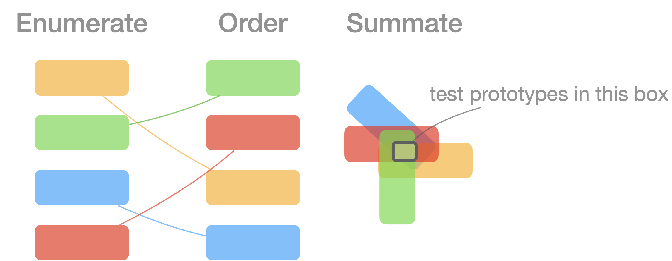
We can define a high-level approach to finding Eames Boxes:
- Enumerate: List all relevant dimensions, and their constraints
- Order: Prioritize these dimensions
- Summate: Combine and find overlaps in constraints, starting with highest-priority ones
Put simply, Enumerate, Order, and Summate Constraints .
2. Design less
Less is More
Avoid adding features
Strive for fewer steps
Simplicity > Complexity
PalmOS
The team behind PalmOS featured prominently in the creation of handheld personal devices—multi-tools that put more power in your pocket than ever before. Even in these highly-innovative design contexts, good design is said to be smaller and simpler than we think.
Less, fewer, simpler is the mantra.
Less is More
Mies van der Rohe
Pioneering modernist architect Mies agrees—addition by subtraction, as the adage goes. We are naturally creative creatures—growers and doers. We have a need for more. More air, more food, more water, more shelter. But with growth comes the need to prune, with doing comes the need to reflect, with building comes the need to take apart and reduce what is excess.
Good Design involves as little design as possible.
Dieters Rams
Rams is recognized as one of the premier industrial designers in history, and he agrees as well—good design is not about the most intricate design, not about the most comprehensive and fully-featured, but the most terse expression that meets the goal. In a world of big, go small.
Big Rigs, Big Data, Big Macs, little design.
But, why?
This is good news indeed! None need permission to slack more than I, and here we have three expert design teams/designers saying it’s A-OK—but ¿por qué? Why exactly should we do less? Don’t we want to give users more features, options and interfaces so they can do more with our designs? Why are these designers saying less?
I think there’s two reasons—among many—that most strongly argue for why one should design less.
Good design is unobtrusive...[and] restrained, to leave room for the user’s self-expression.
Dieters Rams
First, by avoiding over-articulation, we give more space for the user to speak. Design is fundamentally about a user’s experience, so we need to be very considerate of their presence in relation to the design. By trying to engineer more solutions, we often ignore the ingenuity, ability and agency of the user, and invade into their space of usage. Paradoxically, by doing less in design-space, we allow more room for doing in user-space.
What's the simplest possible system I can build that will decompress into the most elaborate set of possibilities?
Will Wright
Will Wright, game designer behind The Sims and Spore, gives our second reason—simpler systems tend to result in more expansive decompressions. We are seeking complexity of experience, not of design. Again, paradoxically, the simpler we fashion the system, the more complex the expressions can be.
So how should we proceed? How do we make something simpler? In our software, it means hitting backspace. What is non-essential that we can eliminate? What can be made lighter, less involved, more focused, more direct and more streamlined?
Great novels tend to have a small set of core characters which drive the story. Too many overwhelm the reader, and the experience suffers. The practice is the same in software design: a small set of essential characters tell the best story.
3. Design interfaces, experiences and learning
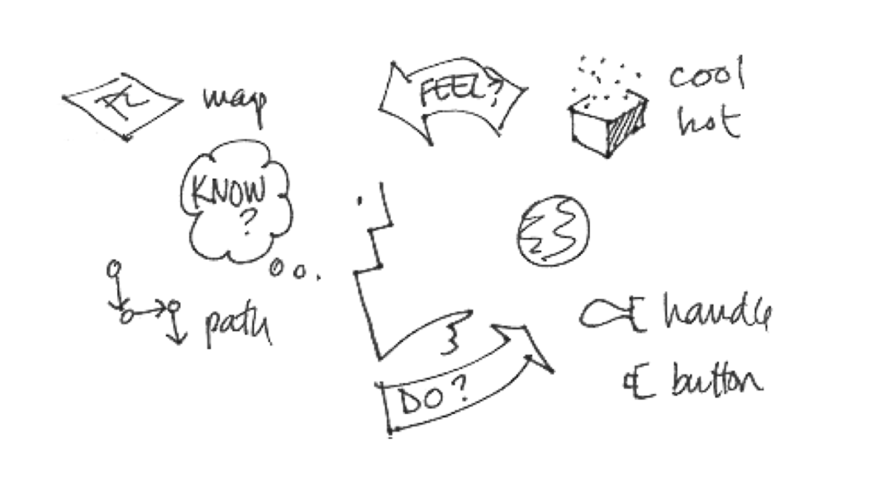
Interaction Designers answer three questions:
How do you do?
How do you feel?
How do you know?
Bill Verplank
I’ve found Bill Verplank to be a fount of knowledge in the area of interaction design. If you haven’t read it already, add Interaction Design Sketchbook to your reading list. It’s only 20 pages, and dense with useful insights.
In one section, he breaks interaction design into three aspects—Do-Feel-Know. These correspond to the interfaces available to the user, and their experience with and knowledge of them. As we design, he gives us three questions to ask about out actions, feelings and knowledge.
How do you do?
Good, and yourself? When it comes to doing, we are concerned with the space of action. What acts can we perform on the system? How can we control it? In the words of Jan Kubasiewicz, “doing means acting”.
Verplank describes two ways of doing in interactive systems: discrete and continuous. In other words, we have two means of controlling an interactive system: in discrete or continuous ways.
We can think of buttons as discrete controls, and sliders, knobs and drag gestures as continuous controls. When we use buttons to turn the volume up on our phones, turn them off or type into them, we are using discrete controls. When we scroll through content and select text, we are using continuous controls.
Together, these discrete and continuous controls define the space of action in our UIs (user interfaces). We can think of UIs as choruses of staccato and legato voices, combinations of discrete and continuous controls used to, well, control the system. The job of the interaction designer is to evoke compelling melodies and beautiful harmonies from this chorus.
How do you do, indeed.
How do you feel?
As we control a system, we need some means of user feedback to indicate how the system is handling their input. When we turn up the volume, we are presented with an indicator showing its level. When we hit the power button, we get lit or black screen indicating whether the device is on.
This feedback dictates, in conjunction with the actions, the experience of using the system. Again, as Kubasiewicz says, “feeling means reacting to feedback.” We can think of our system as a feedback loop, where the user can offer input through controls, and receives feedback through a variety of sensory means: on-screen presentations and motion, haptics, and sound.
These streams of feedback interact with our sensory system in the areas of Sight, Hearing and Touch. These senses define our direct connection with the world, our direct experience, or “immediate feelings”. In addition, it can be said that our sixth sense, “Consciousness”, allows us to form indirect connections as a result of these direct experiences. This reaction to the world produces internal and indirect experiences, or “reflected feelings”.
This is where the world of UX, or user experience, becomes muddied. We can control the ways the device communicates direct experiences, but we can’t control the way the user communicates with themselves—the reaction and reflection space of indirect experiences is out of our direct reach.
Our attempts to understand this space blends art and science (instinct and analysis). Are there methods for conducting user studies in ways to access and learn from these experiences? How should we set-up, observe, ask, and document? Should we study users in less direct ways? Should we study our own selves in intense ways? Should we forego active study altogether and rely on the subconscious through activities like “vision quests”?
Perhaps, as a start, it’s enough to simply ask ourselves, and others, “How do you feel?”
How do you know?
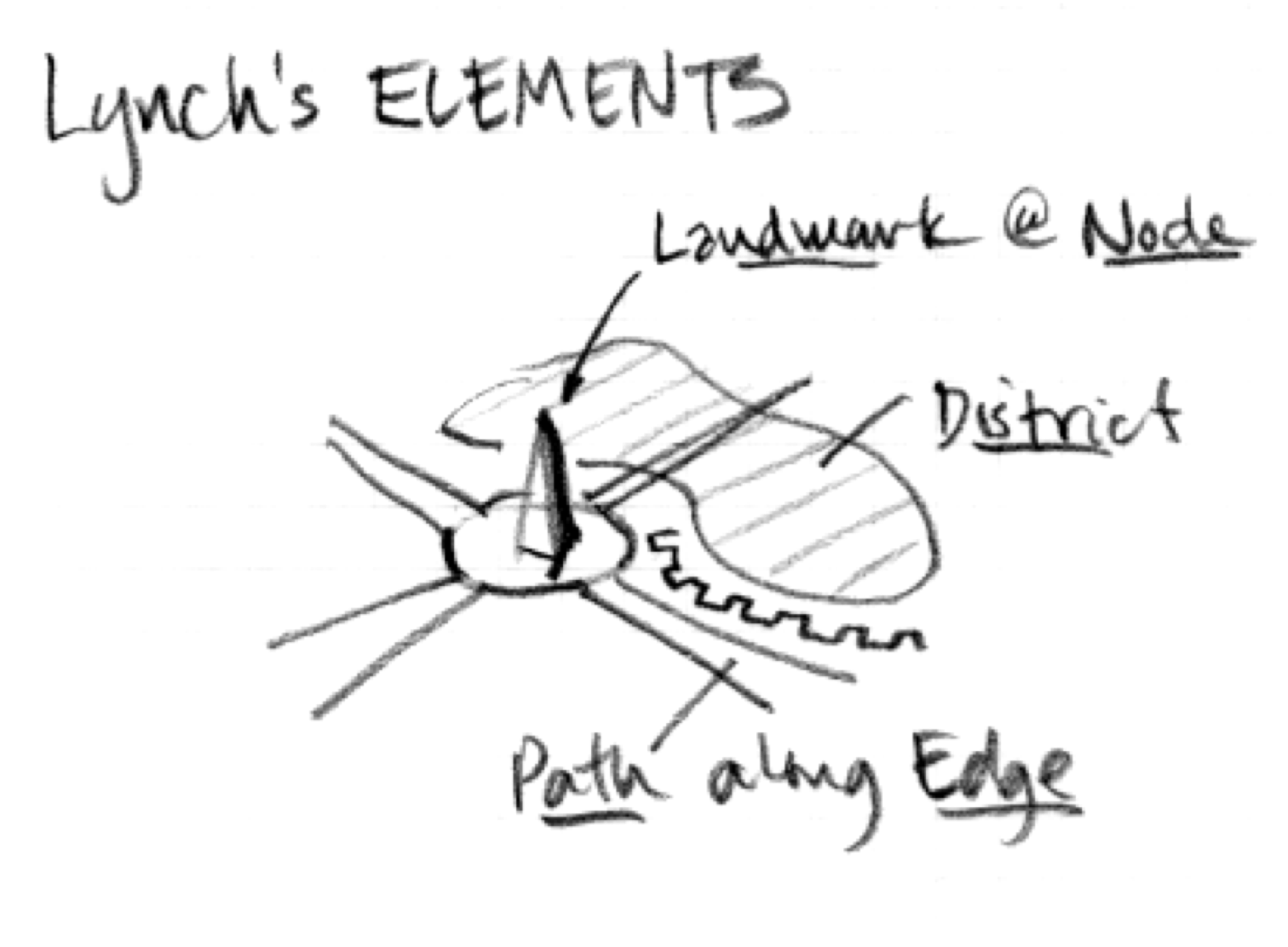
Inside of our interactive systems, we will almost certainly have action-sequences requiring more than one step. In these situations, how is the user to know how to proceed? Verplank suggests considering the way we navigate physical spaces, and calls upon the expertise of city planner Kevin Lynch, who advises on how to make a space more “imageable”.
Lynch was interested in how people formed mental model’s of their city, and what properties of cities might lend themselves to being more easily mapped in one’s head.
He found that more “imageable” cities have two properties, a) landmarks at nodes—to provide direction, and b) paths along edges— separating and emphasizing districts
In our case, the act of knowing, or “learning and understanding the system” (Kubasiewicz), requires that we are able to build mental models and maps of non-physical software spaces. To this end, Verplank suggests using “memorable graphical devices” in key locations to aid in the construction of the user’s mental map. In addition, he understands Lynch’s paths as sequences of actions, and Lynch’s districts with modes. Clear edges between modes help users to follow the right path.
UI, UX, UK
User interfaces are the means, not the end
Michel Beaudoin-Lafon
It is ultimately experiences, not things, that we are designing.
Bill Buxton
In the above sections, Verplank’s Do-Feel-Know showed that software design is not just about UI | UX, but also about the user knowledge (UK) that facilitates the usage of and experience with the interfaces. Here, Buxton and Beaudoin-Lafon point out that the experience of a design is the end, and that the system’s interfaces and the knowledge of the system are the means to this end.
I’d argue that the relation between these three is most strongly modeled by the equation: Feel = Do Know
That is to say, we arrive at the user’s experience by way of combining interfaces with the user’s knowledge on how to use them to accomplish their goals. More, here in UIUK = UX.
4. Design new out of old
What does it mean to have a new idea? Where does it come from?
Songwriters will talk about being “gifted” lyrics, and “divine inspiration” is long recognized as a valid form of idea generation. Whether it’s God or our subconscious, it must be recognized that a large share of ideas are born from a “spark”— a transient flash of thinking—when the picture is filled in to the point you can grasp it.
So how does this picture take shape?
Most ideas come from previous ideas
Alan Kay
Creating is remixing. To a large extent, new ideas are old ideas in new combinations.
Bret Victor
Alan Kay and Bret Victor are two of the best thinkers in the world of software design, and both call out, albeit with qualifications, the nature of new ideas—that they arrive via old ones.
Some are ready to go even further, that it is false to even speak of new.
What has been is the same as what will be, and what has been done is the same as what will be done; there is nothing new under the sun.
Ecclesiastes 1:9
Besides doing our design under moonlight, what are we to do with do with the message of Ecclesiastes. Is there really nothing new? Is it really true that the things that are, and the actions that are done will remain constant forever?
What is new?
We’ll avoid the hermeneutics for now, but engage with this challenge: what is new? As time has progressed, we’ve certainly seen new materials emerge. We can think of the ages: Stone, Bronze, Iron…up until now, in whatever Digital Hyper Age we find ourselves. As time moves, so does the material used in production. New materials mean new designs.
As well, we see that ways that we use the materials—the methodologies—evolve over time, as experiments unearth knowledge that can be shared. What’s more, every second that passes is a new experience in our own existences, evolving our understandings of the world around us. And with each passing second, more life fills the world, each with a unique newness in their contextual situation.
It would seem that life is rich with newness, that under the sun there is much new. But perhaps it is not this newness that is being spoken about in Ecclesiastes.
As stated in our previous pattern, we are seeking to ultimately design experience, which necessarily must be derived from our own. What worth is a chef who’s never eaten? The chef tastes because they seek to understand the experience of their user. And they do so because they understand that the user’s experiences exist in a common plane as theirs. It may not be true that “nothing new” exists between them, but their realities are common enough to allow the chef to be effective.
Sequel Design
So, what insight should we draw from all this?
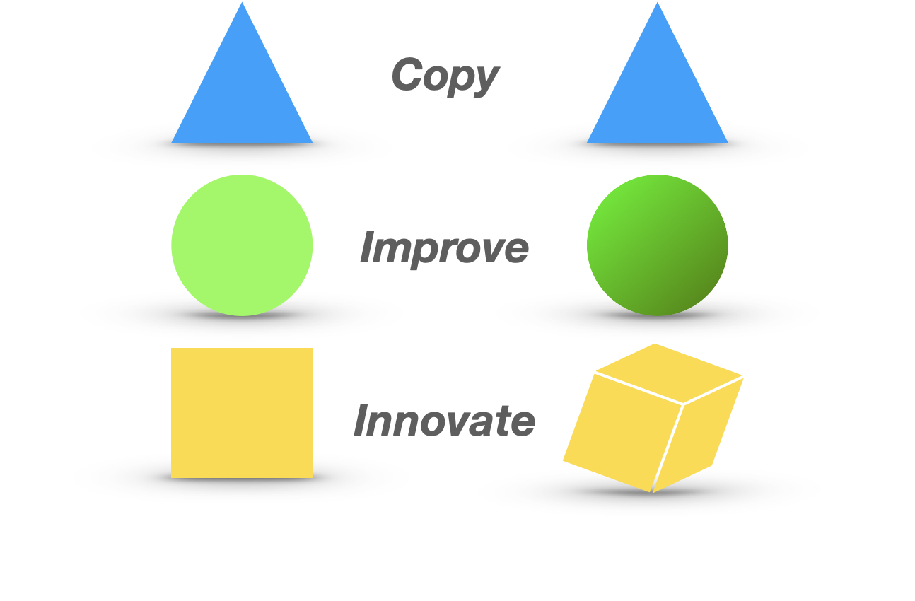
If we view all ideas as being derivative of prior ideas, then perhaps we can view all ideas as being sequel forms. To this end, Sid Meier, game designer behind Civilization, describes his Sequel Design process as being equal parts new, improved, and the same.
33 percent new, 33 percent improved, and 33 percent what everybody already expects to be there.
Sid Meier
We can reverse this order, understanding the three parts as follows:
- Copy: People share experiences. Understand what is expected, and copy that into the design.
- Improve: No experience is perfect. Investigate the design for areas of improvement, and use the strategies of Copy or Innovate to generate ideas.
- Innovate: No experience is complete. What has our design, and other designs in this area, been missing? What ideas can we port in? What ideas can we grow from first principles?
As we approach designs, either initial or iterated, we can use this 33/33/33, or Copy | Improve | Innovate, approach to respond to prior designs, to generate a sequel—something new out of the old.
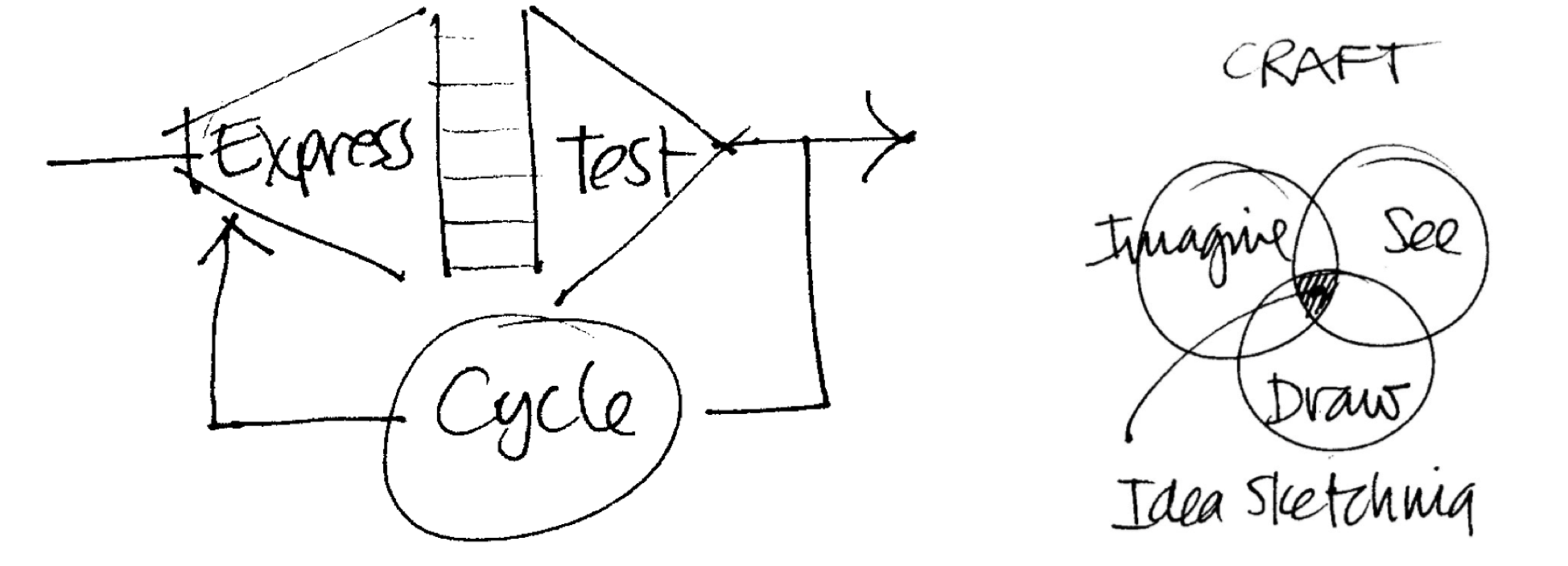
5. Design with tight feedback loops
Creators need an immediate connection to what they create.
Bret Victor
Imagining, shaping, seeing; all at the same time.
Bill Verplank
Whether it’s through sketching, modeling, prototyping or just imagining, design is about creating rapidly. If our thoughts too far outpace our ability to create, then we must constantly “block our mental threads” in order to express them in our creations.
The most immediate connection we can have is to a mental object. Immaterial and infinitely moldable, thoughts are a great design tool. However, our inability to fully experience these objects means that we tend to have weak connection to them—we need to be able to see them and share them.
Instead, we often “cache” these thoughts in physical material—on abacuses, dirt drawings, pen and paper, etc. These externalized representations of thought allow us to have actual objects to interact with, to shape and mold, stretch and squeeze, and share with others.
We can think of the large block of “caching activities” as prototyping. Prototype has an interesting etymology, formed from the Greek for “first” and “impression”. A prototype is our way of initially experiencing the idea, to develop understandings of how the design “looks, behaves and works” before the product. Jane Suri and Marion Buchenau from IDEO describe prototypes as “representations of a design made before final artifacts exist”.
I write because I don't know what I think until I read what I say.
Flannery O’Connor
[My notebooks] aren’t a record of my thinking process. They are my thinking process. I actually did the work on the paper.
Richard Feynman
(paraphrased)
Verplank suggests another triumvirate—Imagine | See | Draw—to guide our approach to sketching. He recommends becoming skilled with a pen, so that our drawings can richly represent our ideas (”seeing feeds drawing, drawing improves seeing”). In this, he wishes to motivate a → Think → Create → Experience → feedback loop, which takes internal representations, makes them external and allows us to reflect, and create new internal representations.
Wrap Up
I’ll avoid holding you any longer than necessary. Let’s close with another pass over the patterns and insights.
-
Design inside the box
→ Enumerate, Order, Summate Constraints
-
Design less
→ Eliminate Non-Essential Aspects
-
Design interfaces, experiences and learning
→ DoKnow = Feel
-
Design new out of old
→ Copy | Improve | Innovate
-
Design with tight feedback loops
→ Think → Create → Experience →