UX = UIUK
A common paradigm when approaching software design is to divide it into two main camps: UI and UX, representing the interfaces presented by the software, and the experience of using these interfaces. While this gets us some ways, it leaves us short of the full story of software design.
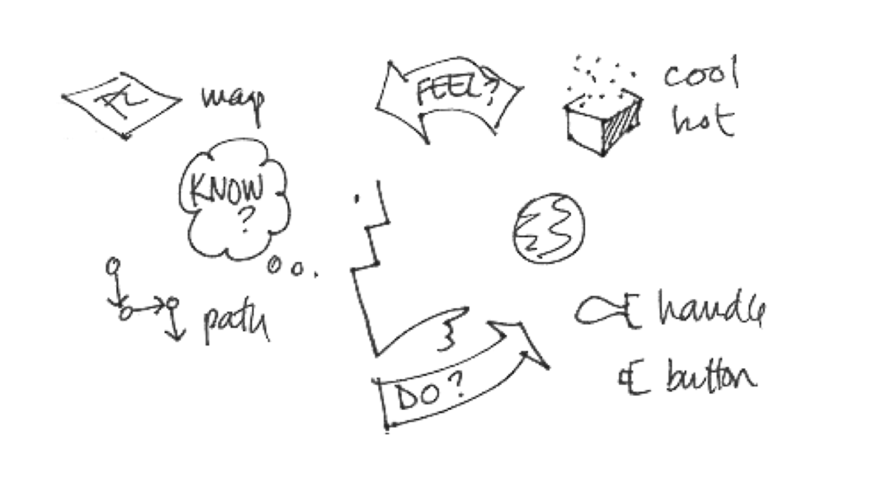
Bill Verplank describes a Do-Feel-Know approach to interaction design (aka software design) in his Interaction Design Sketchbook, calling attention to the interfaces (Do), experiences (Feel) and knowledge (Know) involved with software design.
The experience of the user is not solely a product of the interfaces, but also of the amount they know about how to use them. That is, a user’s knowledge of how to use a software’s interfaces results in their experience with it.
In order to account for this relationship, I’d like to introduce “user knowledge”, or UK into the UI/UX understanding of software design, as a third equally valuable component: UI/UX/UK. What’s more, I’d like to model the relationship between these three aspects as an exponential, where our experience equals the strength of the interfaces to the power of our knowledge, or UX = UIUK.
Power User
Let’s start by thinking of the difference between the novice, average and power (pun intended) user. In one sense, their experience might be the same—they might all derive equal amounts of enjoyment from use of the software, no matter their skill level. In another sense, however, their experiences are greatly different, with the power user often being orders of magnitude more productive.
Power users can quickly navigate through a piece of software, utilizing hotkeys, shortcuts and shortest paths. They have developed a strategy for use that is tuned to their specific needs, and this combination of shortcuts and strategy enables them to stay in the flow of thought and action.
Mr. Bill is a music producer from New Zealand. His tool of choice is a piece of software called Ableton, of which he is certainly a power user. Here, he describes how an understanding of the “physics” of a software— how it internally processes commands—can lead to optimizing command sequences, shaving precious milliseconds off of each small action.
After thousands and thousands of these actions, these savings result in huge differences of productivity. Whether its reducing the number of steps to reach a desired outcome, or finding “pockets” in the screen pixels that lead to faster recognition from the software, each little piece of knowledge a power user wields allows them to be more efficient, and to experience “more” of the software because of this efficiency.
Similarly, the 10X programmer isn’t necessarily 10X smarter than everyone else, they just know how to pilot their IDE in a much more efficient manner. When applied to large information spaces, like code bases, a power user’s ability to quickly navigate and execute command sequences can result in large gains in productivity over the average user.
Design Software
One place I’ve seen this UI^UK = UX equation show up is in design software. Design software is purposed to help a user think by allowing them to freely manipulate text, graphics and potentially their motion on a canvas. Commonly, this software is applied to task of software design, or the prototyping of interfaces and experiences.
Given this capability, that of simulating software, we might imagine that all designers would want to reach for the latest and greatest tools. However, a recurrent theme I’ve seen is the repurposing of slide or image-based tools, like Keynote or Photoshop, to do software design work.
Here, Ken Kocienda (former engineer at Apple) describes his usage of Keynote as a prototyping tool. Here he describes how it can “create the illusion of actual software far better than paper.” As well, the team originally behind Paper describe their process of design here, which strongly featured Keynote.
Part of the reason for these choices is the strength of the interfaces, but more so it is the strength of the user within the software. When we compare the interfaces of Keynote to software like Sketch or Figma, we find them lacking. But in the context of our UI^UK = UX equation, we see that deep knowledge of inferior interfaces can often result in “higher value” experiences.
“Good Software is Intuitive”
I think often software design gets misled by leaning too far into the “intuitive design”. All tools require learning, even a hammer. It is in this knowledge acquisition, whether by direct instruction or acquired over time spent using the tool, that the software is made intuitive.
Some more simple software may be easy to design intuitively, as it does not require much learning on the part of the user. But more complex software, like Keynote, Photoshop, audio and video editors, and text editors will require the user to learn about the “physics” in the software’s world. And in doing so, the user improves their intuitions about how to navigate and act in this world.
Learning Materials
The means that a user has to gain this knowledge is a key area of software design that often goes underlooked. The “good software is intuitive” mentality permits slacking on manuals, guides and other learning materials.
Good learning materials make better users. These materials may be person-to-person—live or recorded instruction in trainings, courses or workshops—or in media form—written and depicted in manuals, books, guides and how-tos.
And the production of these materials can have beneficial influence over other aspects of the software. In an interview, designer Jef Raskin describes how “if it's not easy to write about, it's not easy to use”. He uses “writing as a guide for design”, allowing the weight of the manual to serve as a representation for how easy/hard the software is to use.
The size of the manual (and the size of sections within the manual) directly relates to the amount of knowledge needed to use the software or feature. By shrinking the manual through simplifying the software, we make the software easier to use (there is less to know).
Wrap Up
In summary, I’d argue that the user’s knowledge of how to use the tool is the largest determinant of experience. No matter the interface presented, if the user doesn’t know how to properly use it, their experience will be subpar. As we design software, we should keep this at the forefront, seeking to do what we can to make things simpler, or make knowledge more available.
Raskin encourages us to make explicit the required knowledge in the form of documentation, and to use this documentation as a “guide for design”. As we do so, we are ultimately tuning a function of experience, by way of interfaces and know-how. In other words, UX = UIUK.